
You’re toying with the idea of unconventional color, but don’t want to go crazy. What…
PANTONE COLOR OF THE YEAR: WHAT DOES IT MEAN FOR ME?
Until a few years ago, most people I talk to had never even heard of Pantone, let alone knew what they do. Being in the beauty & fashion industry, the name definitely gets tossed around. But to be honest, I probably only know who they are because my business partner, Annie, grew up in her family printing business and Pantone is king in the printing industry.
If haircolor is my world in the salon, Pantone color is definitely her world in the back office. And every once in while (actually, quite often), our two worlds collide.
Pantone is a company best known for their Pantone Matching System, their system of organizing or standardizing colors. By standardizing the colors, different manufacturers in different locations can all refer to the Pantone system to make sure colors match without direct contact with one another. So in printing, instead of telling someone across the country that you want your invitations printed in “blue ink,” you can use their numbered system to tell them EXACTLY which shade of blue you want. And both parties can be assured that they are picturing the exact same color.
Created out of necessity in the printing industry, it has since been largely adopted in other industries where a way to identify specific colors is needed as well, like in paints, plastics, and fabrics.
And fabrics is where it begins to intersect with beauty.
Every fall, during Fashion Week, Pantone releases its Fashion Color Report, highlighting the “Trending Colors” for the upcoming spring season. These are the colors you’ll see on the runway, in magazine ads, and all over stores by the coming season. The colors you see each season aren’t just trending in clothing, but also in home décor, and makeup and other fashion-forward industries as well. Even our new nail polish collections will feature the trending colors for the season.
In addition to naming their top 10 trending colors, Pantone also names one color as the overall “Color of the Year.” This is a color that they believe represents what’s going on not just in fashion, but in the world and with society, at large. The color that represents our cultural climate, per se.
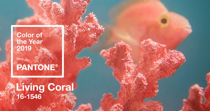
For 2019, the color is “Living Coral” or, more specifically, Pantone #16-1546. Pantone describes Living Coral as “An animating and life-affirming coral hue with a golden undertone that energizes and enlivens with a softer edge.”
So, how do these colors affect you?
Let’s say you’re a fashion-aware person, or even someone who likes to be on trend, but doesn’t want to be carried away by every trend (or color) that comes your way. Well, in home décor, maybe you don’t repaint your living room wall every season, but maybe you change out your pillows, or pictures, or vases, or dishes, or whatever accent pieces you can switch more easily to give a new face to a room.
Well, the same is true in beauty. You can incorporate color trends without completely adopting them. Maybe you add a splash of color to your hair, or maybe you just paint your fingers and toes, or add a new color palette to your regular eyeshadows.
This way, the colors are easy to incorporate, and by the time you’re bored with them, a whole new collection will be starting to trend.
Related Posts


No Comments
-
No comments posted yet